
Every file upload box on your website is a small decision point. Some visitors will click it, some will tab to it, and some will rely on a screen reader to tell them it’s even there. If the interface only works for one of those groups, you’ve quietly turned away the others, along with their applications, their resumes, their invoices, or whatever it is your form was built to collect.
This guide walks through what makes a file upload accessible, the specific barriers that trip people up, and how to design, code, and test an uploader that works no matter how someone navigates the web. Along the way, we’ll look at where a managed upload component can take some of this weight off your team’s plate, since accessibility is one of those things that’s much easier to get right when it’s built in from the start rather than patched on later.
Key Takeaways
Why File Upload Accessibility Matters
An upload field looks simple from the outside, but it’s actually a small cluster of interactive states: a trigger, a selection step, a progress indicator, and a result. Each of those states needs to be reachable and understandable regardless of how someone is browsing.
Common Barriers in Upload Interfaces
Most inaccessible uploaders don’t fail because someone ignored accessibility on purpose. They fail because the interface was designed and tested with a mouse and a monitor, and nothing else.
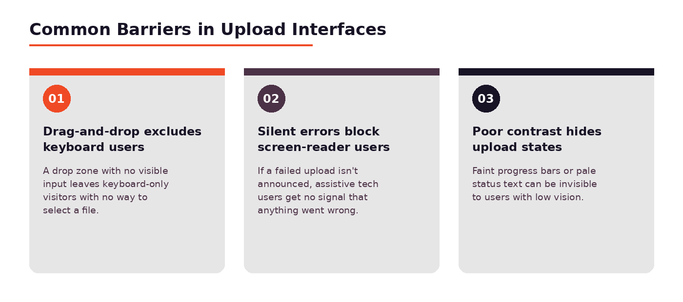
Drag-and-drop excludes keyboard users. A drop zone is a visual target. Without a paired <input type=”file”> that can be reached by tabbing and triggered by pressing Enter or Space, anyone who isn’t using a mouse or touchscreen simply cannot pick a file.
Silent errors block screen-reader users. If a file is rejected for being too large, the wrong type, or a failed network request, and that message only appears as text near the drop zone with no programmatic announcement, a screen-reader user may never know the upload didn’t go through.
Poor contrast hides upload states. A progress bar in light gray on white, or success text in a pale green, can be functionally invisible to someone with low vision, even though it “shows up” on the screen.
Accessibility Benefits for Every User
Fixing these barriers isn’t just a compliance checkbox; it changes who can actually complete your form.
Wider reach and inclusion. People with visual, motor, or cognitive disabilities make up a meaningful share of any audience. An uploader that only works one way narrows that audience without you ever knowing it happened.
Legal and compliance expectations. Standards like WCAG 2.2, along with regulations such as the ADA and the European Accessibility Act, increasingly treat forms and file uploads as core parts of a site’s accessibility posture, not an edge case.
Better usability for everyone. Visible focus states help anyone using a keyboard shortcut. Clear error text helps a user on a spotty connection understand why an upload stalled. Accessible design tends to just be better design.
With the “why” out of the way, it’s worth getting specific about what accessible actually looks like in practice, starting with the most basic requirement of all: can someone complete the entire flow without a mouse?
Keyboard Accessibility
If a sighted mouse user and a keyboard-only user can’t accomplish the same task in the same interface, the interface isn’t finished yet.
Full Operability
Every part of the upload experience needs to be operable from a keyboard alone, from the first click through to confirmation.
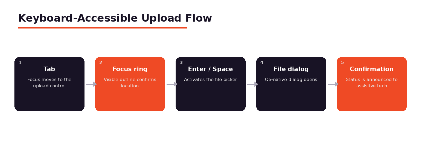
Reachable, focusable upload controls. The button or drop zone that triggers file selection needs a tabindex that puts it in the natural tab order, and it needs to behave like any other interactive element, no div posing as a button without the right role and keyboard handlers.
Keyboard-triggered file selection. Pressing Enter or Space on a focused upload control should open the native file picker, exactly the way clicking it would. This is often as simple as using a real <button> or <label> wired to the input, rather than reinventing the behaviour with JavaScript.
Visible focus states throughout. Focus needs to be visible not just on the initial trigger, but on every subsequent control, remove buttons, retry links, cancel actions, so someone can track exactly where they are at each step.
Getting keyboard support right solves half the puzzle. The other half is making sure people who can’t see the screen at all know what’s happening.
Screen Reader Support
A sighted user watches a progress bar fill up and sees a green checkmark. A screen-reader user needs that same information delivered as speech, at the right moment, without extra noise.
Communicating State
Screen readers rely on the underlying markup and ARIA attributes to describe what’s on the page, so the accuracy of that markup determines the entire experience.
Proper labels and roles. Every control needs an accessible name, a <label> tied to the input, or an aria-label where a visible label isn’t practical, so a screen reader announces “Upload file” instead of just “button.”
Announcing progress and completion. Live regions (aria-live=”polite” for routine updates, aria-live=”assertive” for urgent ones) let you push status changes like “Uploading, 40 percent” or “Upload complete” to assistive technology without requiring the user to go looking for them.
Clear, announced error messages. Errors should be tied to the relevant field with aria-describedby, and significant failures should use role=”alert” so they interrupt and get read immediately rather than being missed.
Getting the announcements right is only useful if what’s being announced actually makes sense to the person hearing it, which brings us to feedback design more broadly.
Inclusive Feedback and Errors
Good feedback tells someone what’s happening and what to do next. Vague or purely visual feedback tells them neither.
Designing Feedback
The goal is feedback that works whether someone is looking at the screen, listening to it, or both.
Accessible progress indication. A progress bar should carry role=”progressbar” with aria-valuenow, aria-valuemin, and aria-valuemax so its state is exposed programmatically, not just drawn on screen.
Errors not conveyed by color alone. A red border is invisible to someone who is colorblind or using a screen reader. Pair color with an icon, bold text, or an inline message like “File too large” so the meaning survives no matter how it’s perceived.
Guidance on how to fix problems. “Upload failed” tells someone something went wrong. “File exceeds the 10 MB limit, try compressing it or choosing a smaller file” tells them what to do about it. The second version is what actually gets the task finished.
Feedback design gets more complicated the moment drag-and-drop enters the picture, because now there are two very different interaction models to support at once.
Drag-and-Drop Done Inclusively
Drag-and-drop is a genuinely nice convenience for mouse and touch users. The mistake is treating it as the interface, rather than one entry point into it.
Progressive Enhancement
Think of drag-and-drop as a layer added on top of a fully functional base experience, not a replacement for it.
Always provide an input fallback. Every drop zone should sit alongside, or wrap, a real <input type=”file”> with a visible “Browse files” or “Choose file” trigger. If JavaScript fails or drag events aren’t supported, the upload still works.
Keyboard alternative to dragging. Because dragging itself is a mouse- and touch-specific gesture, the fallback input covers keyboard users automatically, as long as it’s genuinely reachable and not hidden or disabled.
Consistent behaviour across inputs. Whether a file arrives by drag, by browse dialog, or by paste, the resulting state: file name, size, progress, and any errors, should look and announce identically. Users shouldn’t have to guess whether one method behaves differently than another.
Once the interface itself is solid, the only way to know it’s actually accessible, rather than accessible in theory, is to test it the way real users will experience it.
Testing for Accessibility
Accessibility work isn’t finished at the design or code stage. It’s confirmed at the testing stage, and that testing needs to include real interaction patterns, not just automated scores.
Verification
A thorough accessibility check for an uploader combines a few different methods, because each one catches something the others miss.
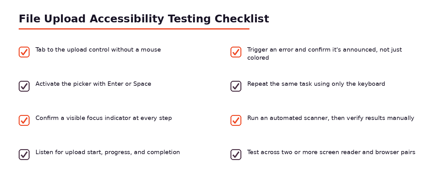
Keyboard-only walkthroughs. Unplug the mouse, or just don’t touch it, and complete the entire upload flow using Tab, Shift+Tab, Enter, and Space. Note anywhere focus disappears, skips a control, or gets trapped.
Screen reader testing. Run the same flow with a screen reader like NVDA, JAWS, or VoiceOver active, and listen for whether labels, progress, and errors are actually announced, and whether they’re announced at a sensible moment, not too early or too late.
Automated and manual checks. Tools like axe or Lighthouse catch missing labels, low contrast, and other structural issues quickly, but they can’t tell you whether an announcement made sense in context. Automated checks are a good first pass; manual testing is what confirms the experience actually works.
All of this is achievable by building an uploader from scratch. It’s also a lot to get right consistently, across every browser and every future update, which is where a pre-built, accessibility-minded upload component starts to make a lot of sense.
How a Managed Uploader Helps
Building every one of these behaviours by hand, and re-verifying them every time a browser updates or a new screen reader ships, is a real ongoing cost. A managed upload solution like Filestack’s file upload component is built to handle that groundwork, so your team can focus on the rest of the product instead of re-testing focus order after every release.
Accessible by Default
The value of a managed uploader isn’t that it replaces good design decisions; it’s that it bakes the ones covered in this guide in from the start.
Prebuilt, accessible upload UI. A ready-made uploader ships with labeled controls, a real file input fallback behind any drag-and-drop zone, and progress and error states that are already wired for both sighted and assistive-technology users.
Keyboard and screen-reader support. Tab order, focus states, and live-region announcements are handled as part of the component, rather than something each team has to implement and re-test on its own.
Consistent cross-browser behaviour. Because the interface is maintained centrally, the keyboard and screen-reader experience stays consistent as browsers and assistive technologies change, instead of drifting out of sync with each update.
If your team is weighing whether to build an uploader in-house or lean on a maintained component, it’s worth looking at how teams upload files online with accessibility already handled, rather than treated as a separate project on top of the upload feature itself.
Conclusion
An accessible file upload isn’t a special version of the feature; it’s just the feature, built so that keyboard users, screen-reader users, and everyone else can actually complete the same task. That means real focusable controls, announced progress and errors, a working fallback behind any drag-and-drop zone, and feedback that never depends on color alone.
None of this requires reinventing how uploads work; it mostly requires not skipping the parts that don’t show up when you’re only testing with a mouse.
Whether you build that experience yourself or rely on a component that already handles it, the test is the same one described throughout this guide: can someone complete the upload without ever touching a mouse, and will they know what happened if it doesn’t work the first time?
FAQs
How do I make a file upload keyboard accessible?
Use a real, focusable control, a native <button> or a properly linked <label>, that opens the file picker on Enter or Space, and make sure every subsequent step (remove, retry, cancel) is also reachable by Tab with a visible focus state.
Does drag-and-drop need a non-dragging alternative?
Yes. Drag-and-drop should always sit on top of a standard file input with a visible browse button, so keyboard users and anyone without drag support can still select and upload a file.
How should screen readers announce upload progress?
Through ARIA live regions and a progressbar role with aria-valuenow set as the upload advances, so status changes like “Uploading, 40 percent” or “Upload complete” are spoken without the user needing to search for them.
How should accessible file-upload errors be written?
Specific and actionable, naming the problem (file type, size limit, network failure) and what to do next, and tied to the field with aria-describedby, with urgent failures using role=”alert” so they’re announced immediately.
Which WCAG 2.2 requirements apply to file uploads?
Relevant criteria include keyboard operability (2.1.1), visible focus (2.4.7 and the newer 2.4.11), name/role/value for custom controls (4.1.2), status messages (4.1.3), and color-independent error identification (1.4.1 and 3.3.1).
How do I test file upload accessibility?
Combine a keyboard-only walkthrough, a screen reader pass with a tool like NVDA or VoiceOver, and an automated scanner such as axe or Lighthouse, automated tools catch structural issues, but manual testing is what confirms the experience actually makes sense.
Is a managed file uploader automatically accessible?
Not automatically, but a well-built one, like Filestack’s, handles most of the groundwork (labeled controls, fallback inputs, announced progress and errors) so teams start from a solid baseline rather than building every behaviour from scratch.
More Stories
How the CloudySocial Team Organizes Tech Help Content
CsTechHelp CloudySocial Recap: Highlights, Lessons, And What’s Next (2026)
CloudySocial CSHardware Promo Code: How To Save On Gaming Gear In 2026